
We asked AI to design new Preston North End home, away and third kits for next season - here’s what it produced
xx
Although there are still eight games to play this term, Preston are sitting pretty in mid-table after picking up a 2-1 win against Portsmouth before the international.


There will be plenty of action going on behind the scenes at Deepdale in the summer, from sorting transfer targets to pre-season scheduling as well as everything in between.
But there’s another crucial job which every fans always keeps an eye out for going into a new campaign - and that is the kit. The excitement of seeing the new home, away and third outfits are one of the most anticipated moments throughout the summer break. So no pressure for whoever has the lead role in designing the fresh look!
As an experiment, we’ve tasked AI tool, Grok, to come up with three new designs which Preston could wear ahead of next season.
With the new age of technology very much here, we’ve been provided with a template as well as a detailed explanation behind the home, away and third kit choices, which Grok has come up with.
Take a look to see whether outfits designed by AI are hits or misses.
Preston home shirt - and what Grok had to say

The design for the speculative Preston North End 2025-26 home shirt was crafted based on a blend of the club's historical identity, recent kit trends, and modern football aesthetics. Here’s the reasoning behind the choices:
- White Base with Navy Accents: Preston North End, known as the "Lilywhites," have a long-standing tradition of white as their primary color. The navy accents pay homage to the club's secondary colour, often seen in their kits, and provide a striking contrast that aligns with their branding.
- Creative Sash or Geometric Pattern: The inclusion of a sash or geometric design draws inspiration from the club’s past kits, where sashes have been a notable feature (e.g., the 2024-25 kit had a subtle diagonal element). The geometric patterns in the generated designs add a modern twist, reflecting Castore’s recent approach to combining tradition with innovative aesthetics. This also hints at performance tech, as geometric lines can suggest ventilation or lightweight fabric structures.
- Modern Performance Tech: Football kits today emphasize functionality (e.g., breathability, moisture-wicking), and Castore, Preston’s current kit manufacturer, is known for integrating advanced materials. The designs incorporate subtle line work and paneling to imply these tech features, which are visually appealing and practical for players.
- Club Crest and Details: The placement of the Preston North End crest, along with a potential 140th anniversary badge (celebrating the club’s founding in 1885), ties the design to the club’s heritage. This is a common feature in anniversary or special edition kits, and given the timeline (2025 being close to a milestone), it felt fitting to include.
- Variety in Interpretation: The multiple images generated offer different takes—some with bold sash designs, others with abstract geometric overlays—to reflect the uncertainty of the official design while staying within the realm of plausible evolution from past kits (like the 2024-25 Castore design). This variety allows for creativity while respecting the club’s identity.
Preston away kit - and what Grok had to say
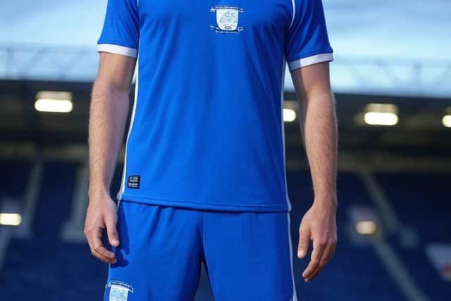
The design for the Preston North End away kit was crafted with a few key considerations in mind. Since Preston North End is traditionally associated with navy blue and white colours, I opted for a bold blue base to distinguish the away kit from their home kit while still nodding to the club's heritage. The solid blue provides a clean and modern look, which is popular in contemporary football kits.
The white accents on the collar, sleeves, and shorts' side stripes add a contrasting element that ties back to the club's colour scheme and enhances visibility on the pitch. The placement of the club crest on both the shirt and shorts reinforces brand identity and pride, a common feature in professional kits to ensure recognition.
The background setting of a stadium at dusk or night adds a dynamic feel, suggesting the kit is designed for high-energy away matches under the lights. The Nike logo reflects a partnership with a major sportswear brand, which is typical for clubs like Preston North End in the competitive football landscape.
This design balances tradition with a fresh aesthetic, aiming to appeal to both long-time fans and new supporters. If you'd like adjustments or have specific preferences (e.g., different colours, patterns, or sponsors), feel free to let me know! Would you like me to generate another version based on your feedback?
Preston third kit - and what Grok had to say
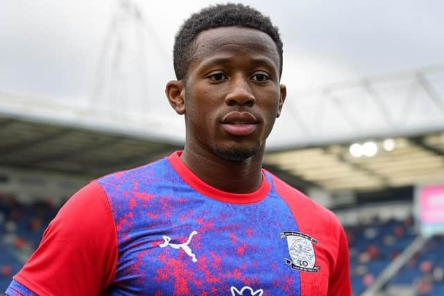
The design choices were influenced by the need to create a fresh and distinct look while respecting the club's traditional identity. Preston North End is historically associated with navy blue and white, often with red accents, as seen in their existing kits. For the third away kit, I opted for a bold departure by incorporating a mix of colours that still nod to the club's heritage but offer a unique aesthetic.
The design features a combination of blue and red, with a gradient or splattered pattern to give it a modern, dynamic feel. The blue represents the club's primary colour, while the red adds a striking contrast and ties into the accents seen in their current kits (like the one in the image you provided). The pattern adds a creative twist, suggesting movement and energy, which could appeal to fans looking for something innovative in an away kit. The placement of the club badge and sponsor logo was kept consistent with traditional kit designs to maintain professionalism and recognisability.
This approach allows the kit to stand out as a third option while still feeling connected to Preston North End's identity.
Your next Preston read: FA Cup technology confirmed for quarter-finals except Preston North End vs Aston Villa