What do you think of South Ribble Council's proposed new look?
This article contains affiliate links. We may earn a small commission on items purchased through this article, but that does not affect our editorial judgement.
and live on Freeview channel 276
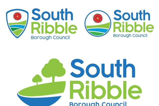
All three focus on the borough’s greenery and the River Ribble, while two of them also incorporate the Lancashire rose.
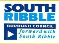
Papers presented to a meeting of South Ribble Borough Council’s cabinet heard that the authority is set to undergo a £20,000 rebrand to replace the “shouty” block capitals of the current logo with a more “friendly font”.
Advertisement
Hide AdAdvertisement
Hide AdThe existing design was created in conjunction with college students and includes the strapline: “Forward with South Ribble”.
The new logos have been created in-house at the authority and, once one has been chosen, it will initially replace the signage on the council’s Civic Centre headquarters in Leyland and the livery on vehicles, staff uniforms and the council website. All other materials will continue to bear the current version until they actually require replacement.
“We have tried to incorporate our commitment to the green agenda,” said South Ribble’s communications and visitor economy lead Andrew Daniels of the three proposed designs.
“You can choose a logo and some people will like it and some people won’t – but it’s how it’s used as part of the wider rebrand.
Advertisement
Hide AdAdvertisement
Hide Ad“I think we can make sure…all the things we do in South Ribble are linked across, look nice and fresh and, when we’re out and about in the borough, [people] can see what the council is doing for their local community.”
A recent residents’ survey found that locals had a largely neutral response to the current logo when assessing the impression it gave about whether the council was trustworthy, professional and modern.
Conservative opposition member Michael Green called for the rebrand to be scrapped – but said at the very least the existing design and crest should be added to the list of options for residents to consider.
“We might then genuinely be able to assess whether [the borough] prefers to stick to one of the current options or move to one of the new ones,” Cllr Green said.
Advertisement
Hide AdAdvertisement
Hide AdHowever, council leader Paul Foster said that it was time for a new look.
“Every organisation refreshes its corporate image and identity as it moves forward – South Ribble hasn’t done that for a number of years.”
Interim chief executive Gary Gall also stressed the importance of a “modern and fresh” logo for the forthcoming redesign of the council’s website.
But Lib Dem group leader David Howarth – whose party supports the minority Labour administration on an issue-by-issue basis – was not impressed with the options, which are being consulted upon via the council’s social media channels.
Advertisement
Hide AdAdvertisement
Hide Ad“I think the current logo is pretty horrible and dated, but a couple of [the new ones] look like the sort of designs that one of my lads would have done for his football shirt for the under-15s rather than a local authority.”
The implementation of the rebrand will be funded by reserves carried forward from the last financial year.
To have your say on the proposed logos, click here.
Comment Guidelines
National World encourages reader discussion on our stories. User feedback, insights and back-and-forth exchanges add a rich layer of context to reporting. Please review our Community Guidelines before commenting.