
This is how Preston's 'posh' Insta-worthy sign looks after four years
It was first unveiled four years ago, as a symbol of Preston’s rich cotton and textile history.
It was commissioned as part of the city's Welcome Back Fund action plan, funded by the European Regional Development Fund (ERDF) through the Department for Communities and Local Government, designed by David Cox Architects and made by Steeleson Fabrications in their Kirkham workshop.
Councillor Javed Iqbal, then Mayor of Preston, hailed the sign as “fantastic”, and called it "a piece of art Preston will be proud of for many years to come”.

A spokesman for David Cox Architects said: “We very much hope it becomes a fun photo opportunity for locals and visitors alike”.
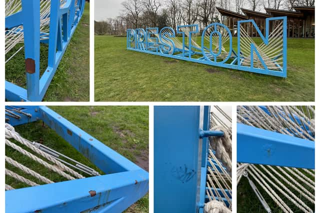
Four years on, the sign still does still draw attention, and people do still pose for their photo next to the public artwork, but it’s appearance has been called into question.
One visitor to Avenham Park said: “I love the sign, but it’s started to look a bit shabby when you get up close. It’s a shame, because it’s literally a symbol of the city, and should be kept looking tidy.”
Enjoy unlimited access to local news, the latest football stories and new puzzles every day.
With a digital subscription, you can see fewer ads, enjoy faster load times, and get access to exclusive newsletters and content. Click here to subscribe.
The sign has many large areas of rust, bubbled paint, scratches, graffiti and dirty ropes.
Another said: “I know it’s left out in the open, but it’s not looking its best and could do with some TLC. Put a bit of pride back into Preston’s sign.”