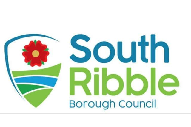
South Ribble Council reveals new logo after residents were asked what they think
and live on Freeview channel 276
South Ribble Borough Council has unveiled its new logo amid a political spat over whether the design is too modern.
The authority’s cabinet approved the rebrand after asking residents and staff what they thought of three options during a consultation last month.
Advertisement
Hide AdAdvertisement
Hide AdThat process resulted in the creation of a tweaked final version that took into account the 350 comments received about the proposals.
Members were told that each of the options had its admirers and that none of them was “significantly disliked”.
However, the incorporation of the Lancashire rose did divide opinion, with some liking the clear county identity and others feeling it dated an otherwise fresh design.
“The general principle of incorporating the green agenda, the river and some of elements of the original South Ribble crest were all broadly supported,” explained Andrew Daniels, shared services lead for communications.
Advertisement
Hide AdAdvertisement
Hide Ad“Part of the feedback we got was that residents are very aware of the cost of this type of thing - and that is reflected in us doing it on a replacement-only basis. We’re not going to be replacing things for the sake of doing it.”
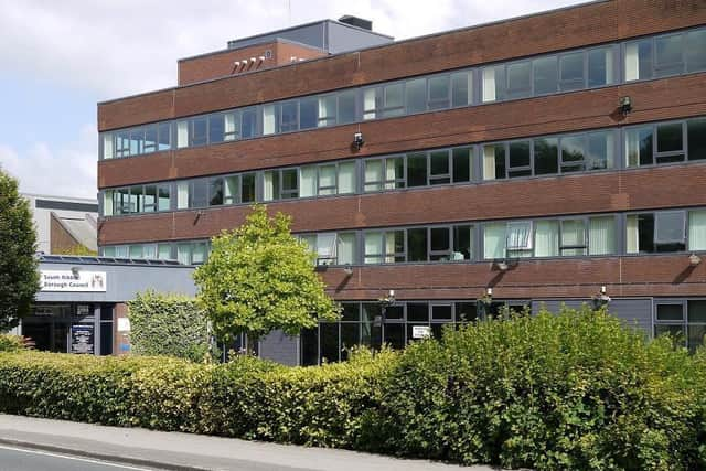
The new logo will initially appear on the authority's headquarters and soon-to-be-relaunched website - but will only replace the current branding on items such as wheelie bins when those items come to their end of their useful life.
The emblem was designed in-house and £20,000 was set aside from within existing budgets to meet upfront costs.
“We are going to come out of the present [Covid] challenges and it is important that we present an image that is progressive, exciting and does denote everything we stand for,” said deputy leader Mick Titherington.
Advertisement
Hide AdAdvertisement
Hide AdHowever, Conservative opposition member Michael Green questioned the premise that a redesign was needed to promote the authority’s digital presence.
“There are lots of councils that have very traditional logos - and that doesn’t stop them marketing what [they] are doing via social media, websites or [in] printed form.
“It’s about what services and facilities you are offering your residents, not a fancy rebranding exercise,” Cllr Green said.
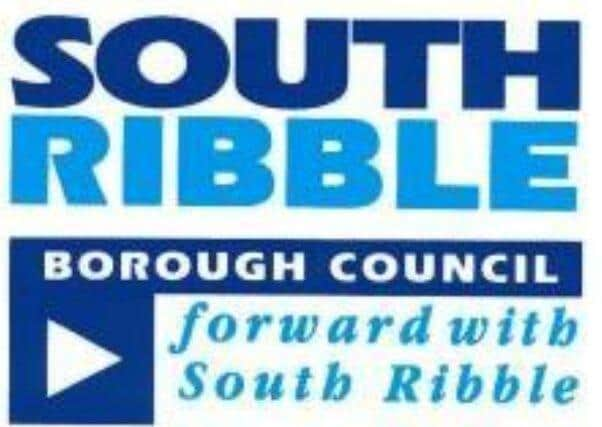
Fellow Tory Phil Smith added that he was a “traditionalist” who would have preferred to see the traditional South Ribble shield used in the new design if the old logo could not be retained.
Advertisement
Hide AdAdvertisement
Hide AdHowever, council leader Paul Foster accused Cllr Green of “hypocrisy”, because the Conservative administration at Lancashire County Council - of which he is a part - changed that authority’s logo soon after taking control at County Hall in 2009.
Meanwhile, South Ribble cabinet member for finance Matthew Tomlinson drew a comparison with Wigan Warriors rugby league club.
“They have got a well-established, but very old fashioned, crest.
“To hear their chief executive explain why they’re [rebranding], it was a mirror image of the comments we had here - a club that has a great tradition, but needs to move forward and engage in the digital era.
“So we have an organisation that I would argue is more famous - and possibly more loved - than South Ribble Borough Council going through exactly the same process,” Cllr Tomlinson said.